SUMMARY
An editorial project exploring counterculture, perception and time through multiple voices—without moralising. Readers enter the protagonists’ inner worlds and travel between external reality and interior landscapes. Link Award.
PROBLEM
Balance readability and expression without glorifying or lecturing; preserve rawness and humanity with responsible design.
RESEARCH
- Benchmark: punk fanzines, underground press, narrative non-fiction.
- Visual archive: xerox textures, halftones, DIY lettering.
- Readers: non-fiction lovers, cultural studies, design/editorial audiences.
EDITORIAL STRATEGY
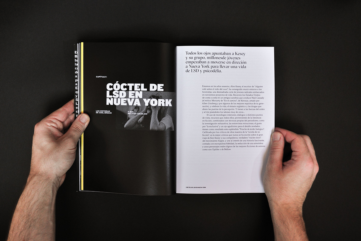
- Contextual prologue; one character per chapter.
- Short documentary interludes (dates/places).
- Paratexts: compact glossary, margin notes, references.
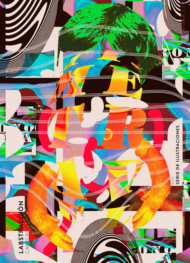
ART DIRECTION & VISUAL SYSTEM
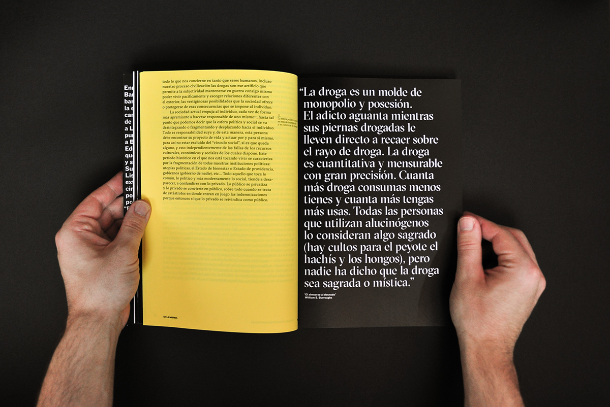
- Reading serif for body; condensed grotesk/mono for display.
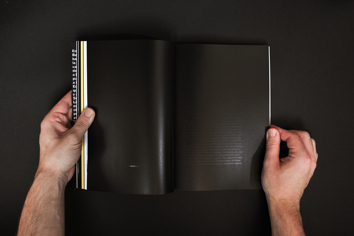
- 2–3 column grid, generous margins, epigraph-led openings.
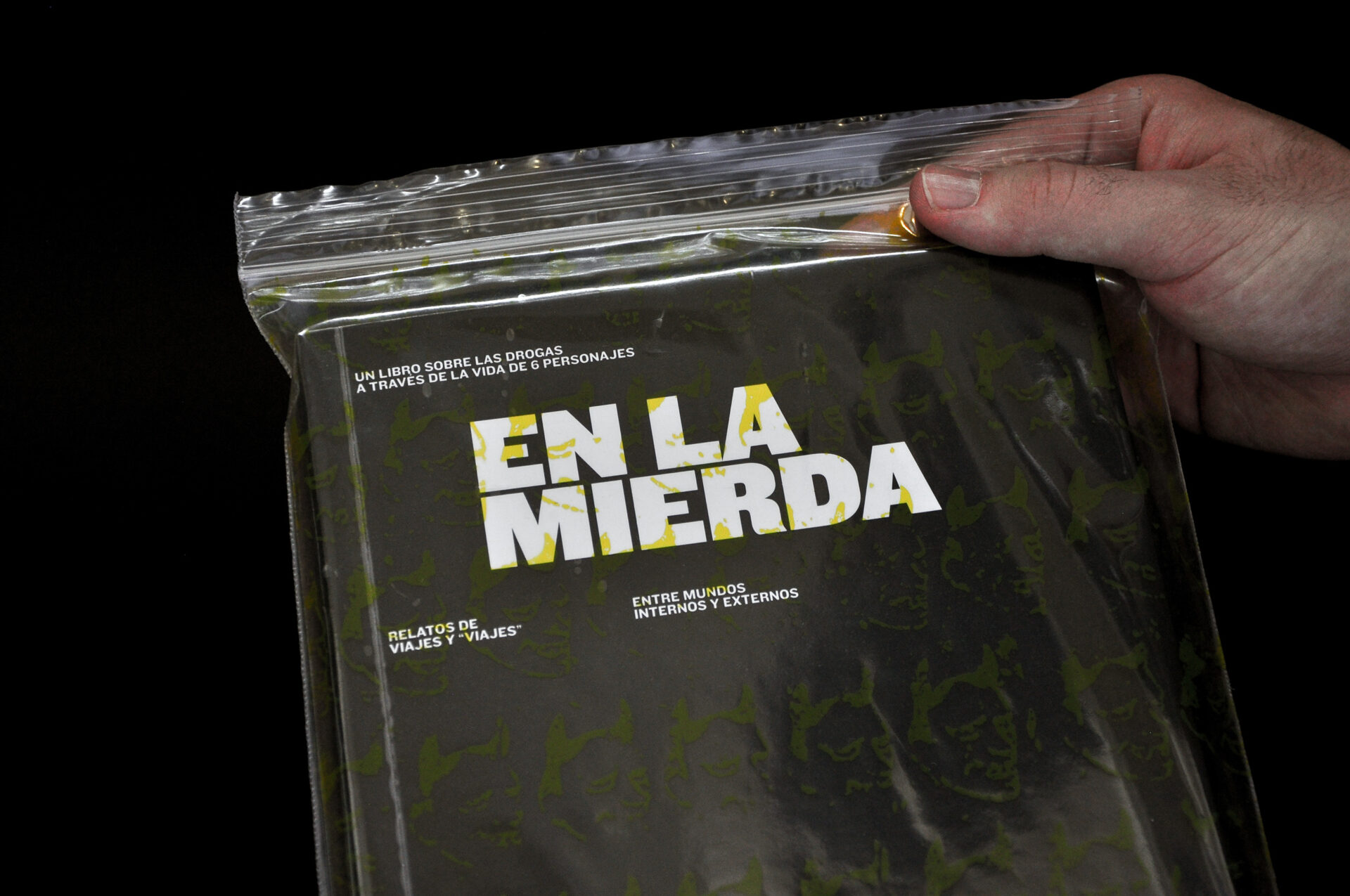
- Light xerox textures, restrained colour (duotone in chapter starts).
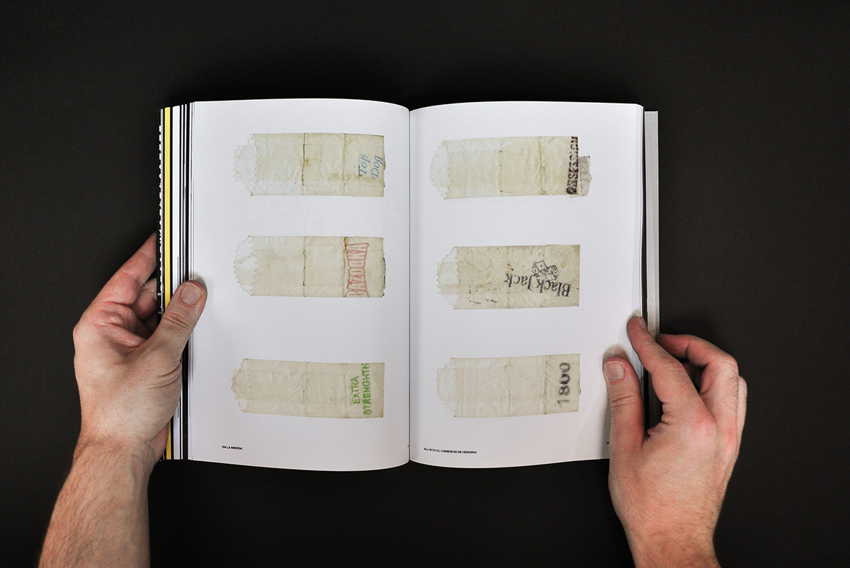
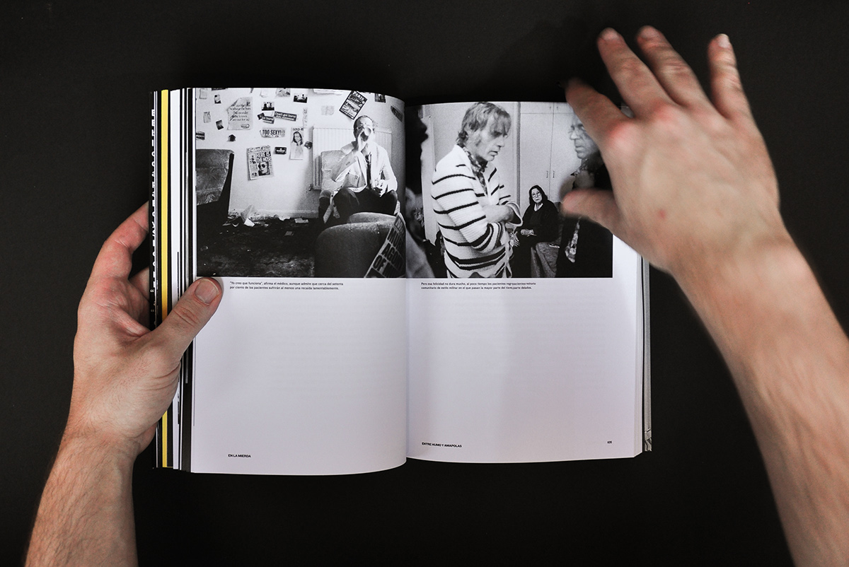
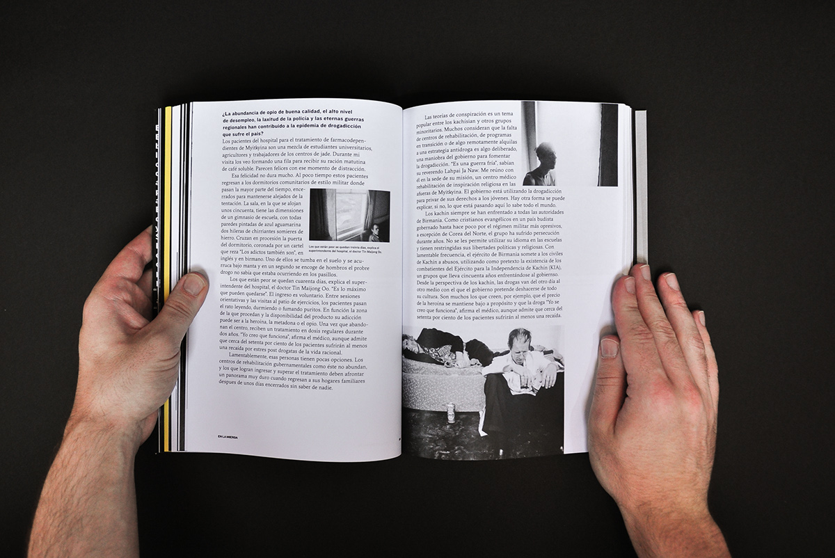
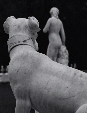
- Archival imagery and non-figurative textures—no sensationalism.
- Accessibility: AA contrast, 130–140% leading, 60–70 CPL.
PROCESS
- Moodboards and wordlists to define tone.
- Editorial wireframes: TOC, chapter opener, notes, interludes, colophon.
- Composition tests (sizes, leading, column widths) and long-read trials.
- Iterative feedback with editor and beta readers.
- Style guide for type, colour, textures, credits and citation.
ETHICAL FRAMEWORK
- Historical context and sensitive-language note.
- No “how-to” content; focus on testimony and consequences.
- Clear separation of fiction vs. archive; sources cited.
- Sensitivity reading (when needed) and legal review.
PRODUCTION
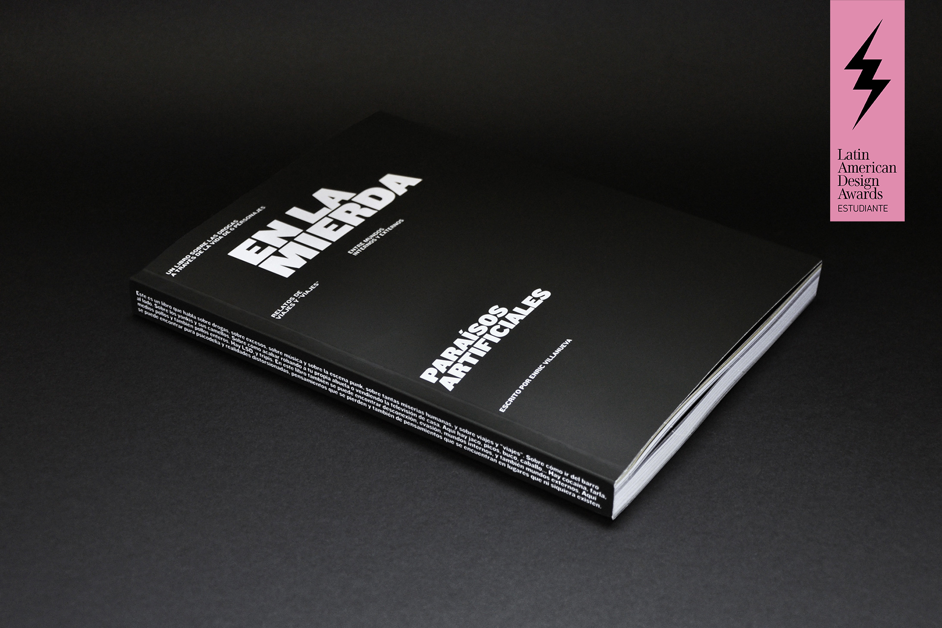
- Interior 100–120 g/m² uncoated; cover 300 g/m²; sewn PUR paperback.
- Black + one spot colour in chapter openings (duotone).
- Approx. 140×210 mm or 150×230 mm; subtle emboss/spot varnish.
LEARNINGS
- Voice, type and page rhythm must align to sustain immersion.
- Contained visual palette avoids cliché and builds trust.
- Paratext adds clarity without breaking the narrative flow.
- Design first for long-form reading, then for visual punch.