SUMMARY
StoneCares is a marble furniture and decor brand that transforms the home with quality, warmth and design. It integrates a social purpose supporting cancer-related causes—its name underlines that commitment. In four months we developed strategy, identity and an application system for print, web and social. Currently in implementation.
PROBLEM
Build an elegant, contemporary brand that preserves marble craftsmanship and communicates real social impact with warmth and credibility in the premium segment.
RESEARCH (SHORT BRANDING SPRINT)
- Benchmark across stone/luxury design and cause-driven brands.
- Short interviews with decor buyers and artisans.
- Findings: authenticity, donation transparency and tactility matter.
BRAND STRATEGY
- Purpose: elevate spaces and care for people.
- Promise: timeless elegance and responsible craftsmanship.
- Values: craftsmanship, care, transparency, durability.
- Positioning: premium design with tangible social impact.
- Tone of voice: calm, approachable, non-triumphalist.
- Tagline: Elegance that cares.
CREATIVE CONCEPT
Embracing veins: marble veins as a metaphor for care and time, expressed as an SC monogram and a continuous stroke adaptable to different causes.
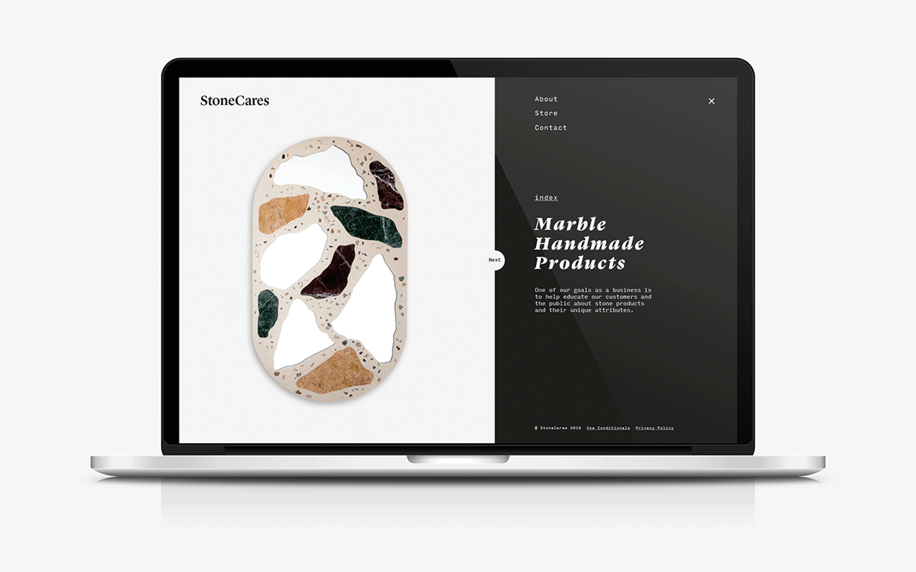
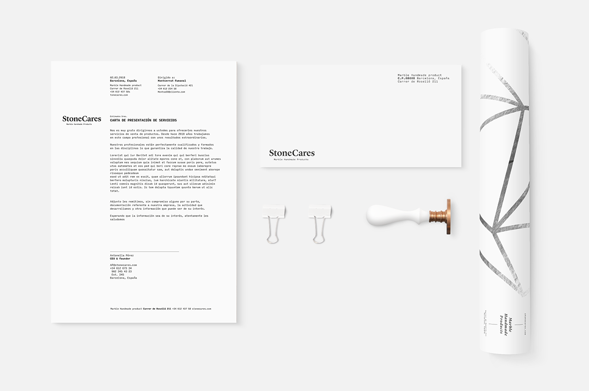
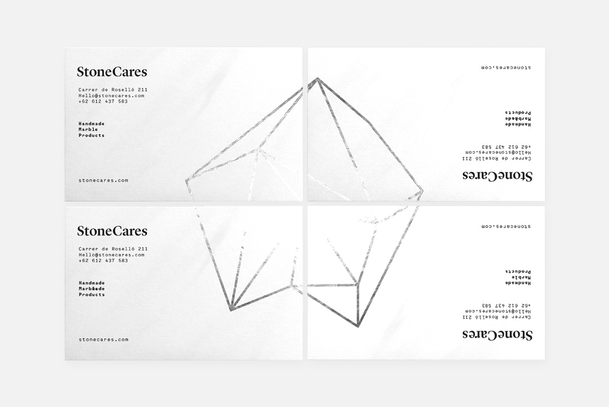
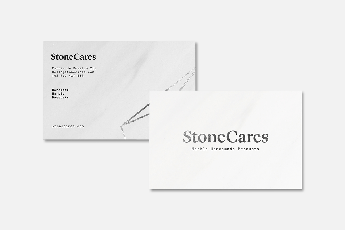
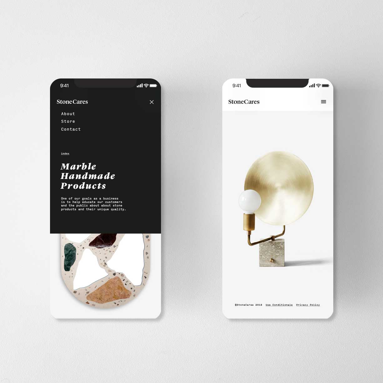
VISUAL IDENTITY
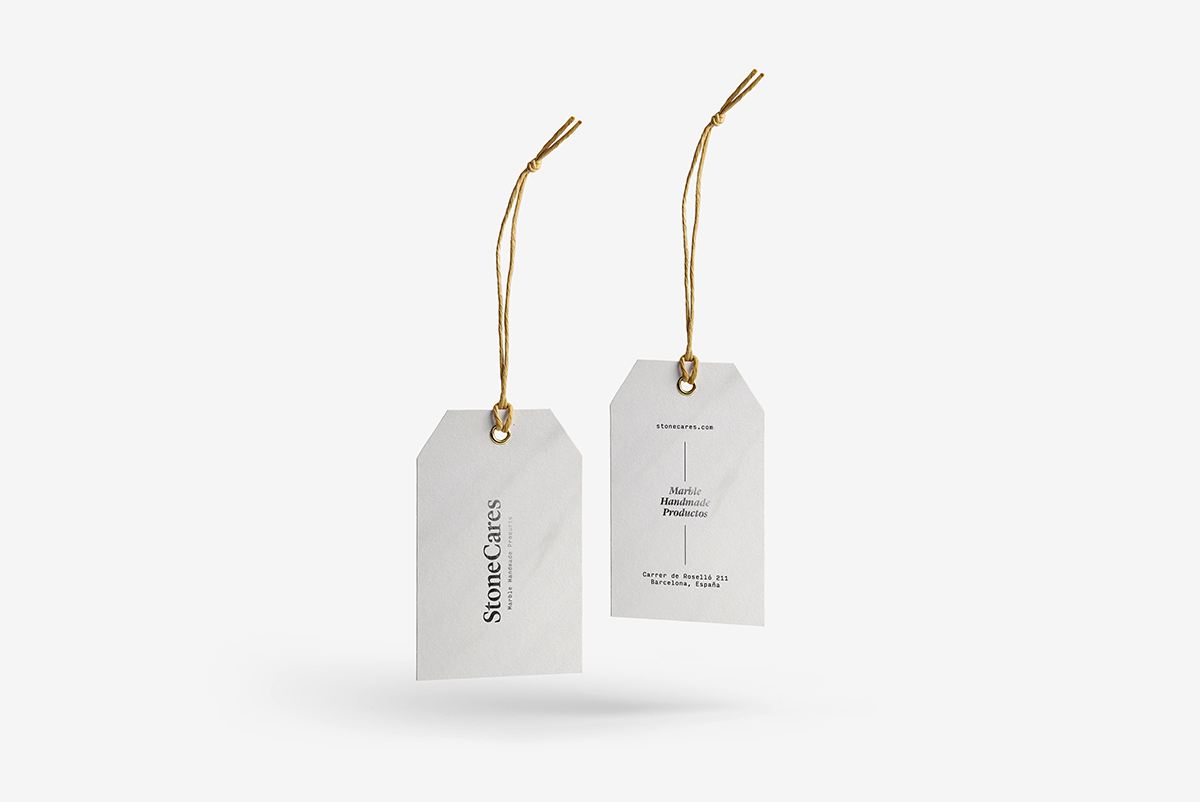
- Logotype in serif + SC monogram for seals and embossing.
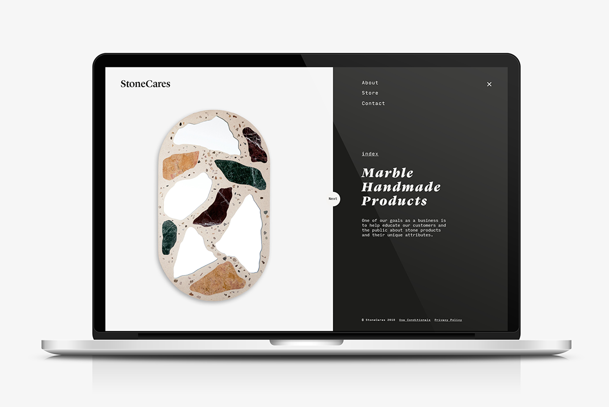
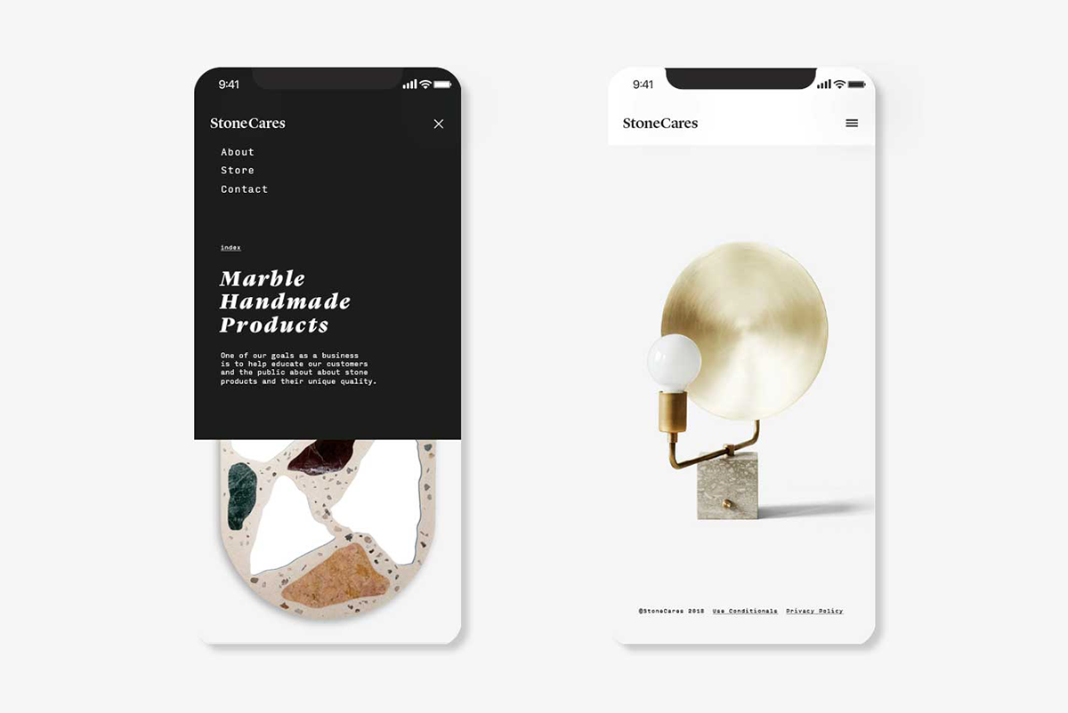
- Type: editorial serif (headlines) + humanised sans (body/UI).
- Colour: marble neutrals + configurable cause accent.
- Photography: warm lifestyle; focus on texture and artisan hands.
- Finishes: letterpress/emboss, subtle hot foil, uncoated stocks.
APPLICATION SYSTEM
- Stationery: card, letterhead, envelope, delivery note, e-mail signature.
- Packaging: bag (with printed sketch tests), belly band, hangtag, thank-you card.
- Digital: website look & feel (hero, product page, cause banner, transparency), social templates.
- Brand guide: logo, colour, type, grids, tone and examples.
PROCESS (4 MONTHS)
- Discovery: interviews, moodboards and competitive map.
- Strategy: purpose, promise, values and narrative.
- Design: visual routes → selection → iterations with founder feedback.
- Production: final artwork, printed mockups (bag/card), mini brand guide and implementation kit.
CAUSE & TRANSPARENCY
- Per-sale donation model (fixed percentage disclosed).
- Transparency page with periodic reports.
- Partnerships with accredited organisations; responsible ribbon/colour usage.
LEARNINGS
- Turning “cold” marble into a warm experience relies on touch, photography and careful microcopy.
- Consistency between purpose, tone and material finishes boosts credibility.
- Early printed prototypes are key to validating colour and finishes.