SUMMARY
Academic project at RMIT Online (Australia) to refresh and deepen UI/UX and Product Design skills. I worked across research, problem framing, information architecture, flows, low-, mid- and high-fidelity wireframes, component system, prototyping and qualitative usability testing. Challenge: design a digital “piggy bank” (app + device) that makes saving easy and motivating for adults.
PROBLEM
- Difficulty maintaining consistent saving habits.
- Limited visibility of progress and unclear goals.
- Fragmented tools without a cohesive flow.
- Need to balance simplicity and control.
RESEARCH & APPROACH
- Desk research and competitive scan of saving patterns and nudges.
- Short interviews and qualitative usability tests on key tasks (create goal, deposit, edit goal, review progress).
- Personas and scenarios focused on clarity, light automation and basic control.
- Scope definition and qualitative success criteria (comprehension, clarity, friction reduction).
GOOD UX/UI DESIGN PATTERNS APPLIED
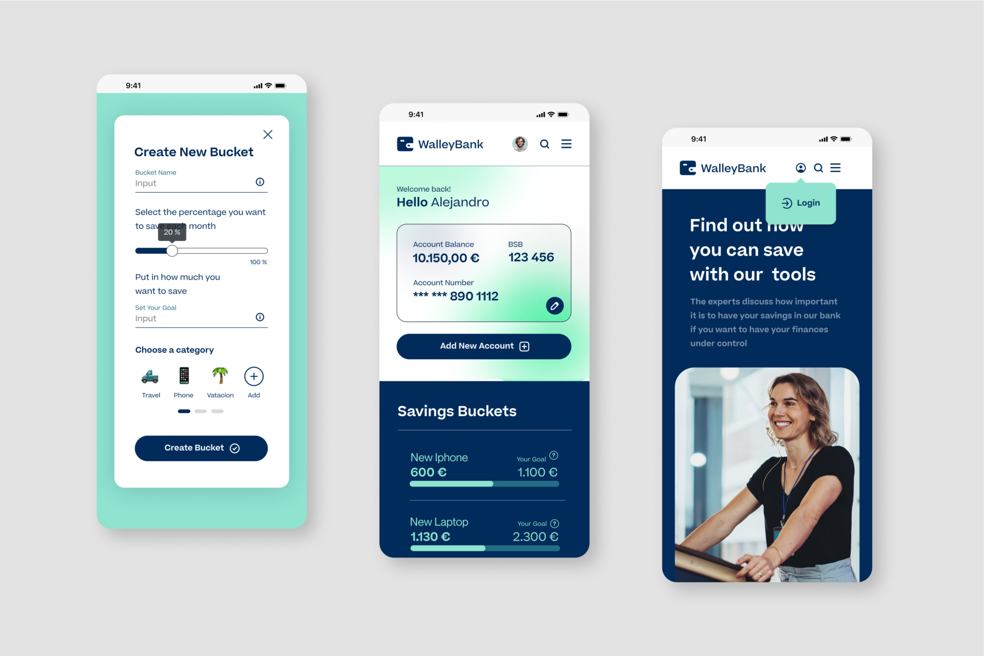
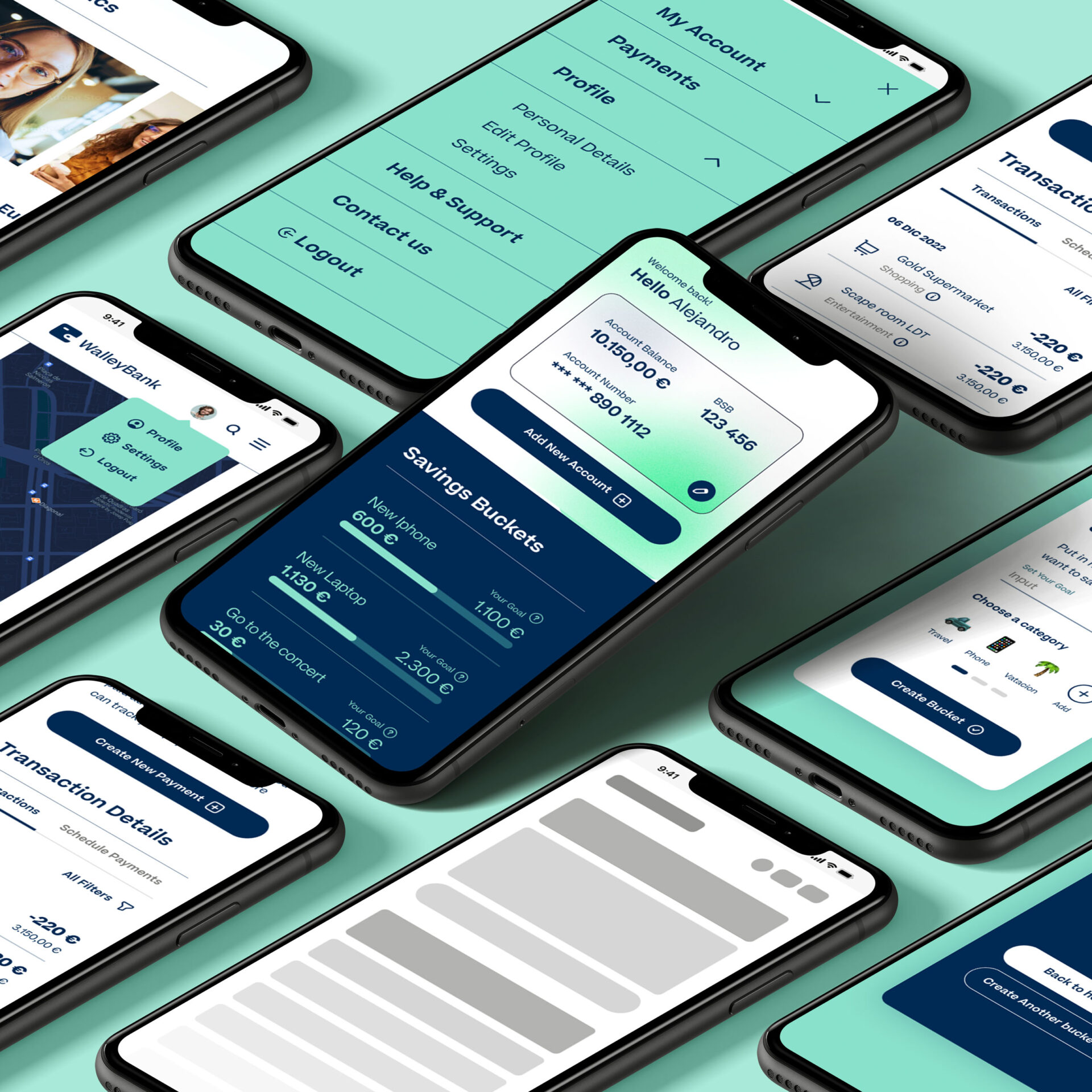
- Empty states with examples and a direct CTA (“Create your first goal”).
- Three-step goal wizard with visible progression and partial save.
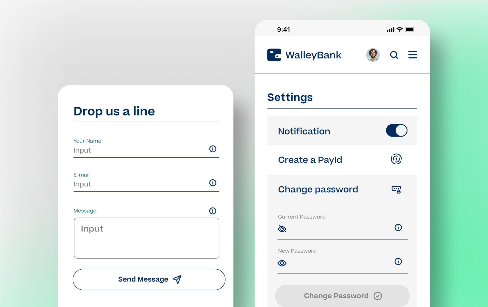
- Numeric keypad, currency formatting and inline validation.
- Sticky primary CTA (“Deposit now”) within the goal view.
- Action-oriented microcopy and smart defaults (common goals).
- Progress visualisation (bar, percentage, ETA) with milestones.
- Confirmations with “Undo” (snackbar) to reduce anxiety.
- Accessibility AA, touch targets ≥44×44 px, visible focus, clear labels.
- Clear tabs: Goals, Activity, Learn (in-context micro-lessons).
- Skeleton loading and error states with guided recovery.
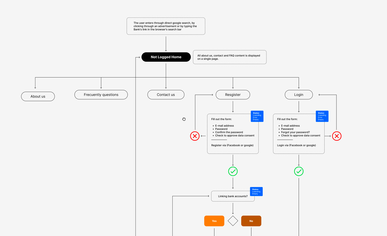
KEY FLOWS & FRICTIONS RESOLVED (QUALITATIVE)
- Onboarding → First goal → First deposit: unified terminology (“Goal”), consistent iconography and goal-oriented copy.
- Goal edit: surfaced the action on the card and used a sliding sheet (modal bottom sheet).
- Deposit/withdrawal: simplified numeric input, clear limits and reversible confirmation.
- Reminders & education: opt-in frequency and in-context micro-lessons.
PRODUCT DESIGN DELIVERABLES
- Experience map and task flows (happy/sad paths, edge cases).
- Low-, mid- and high-fidelity wireframes (mobile-first).
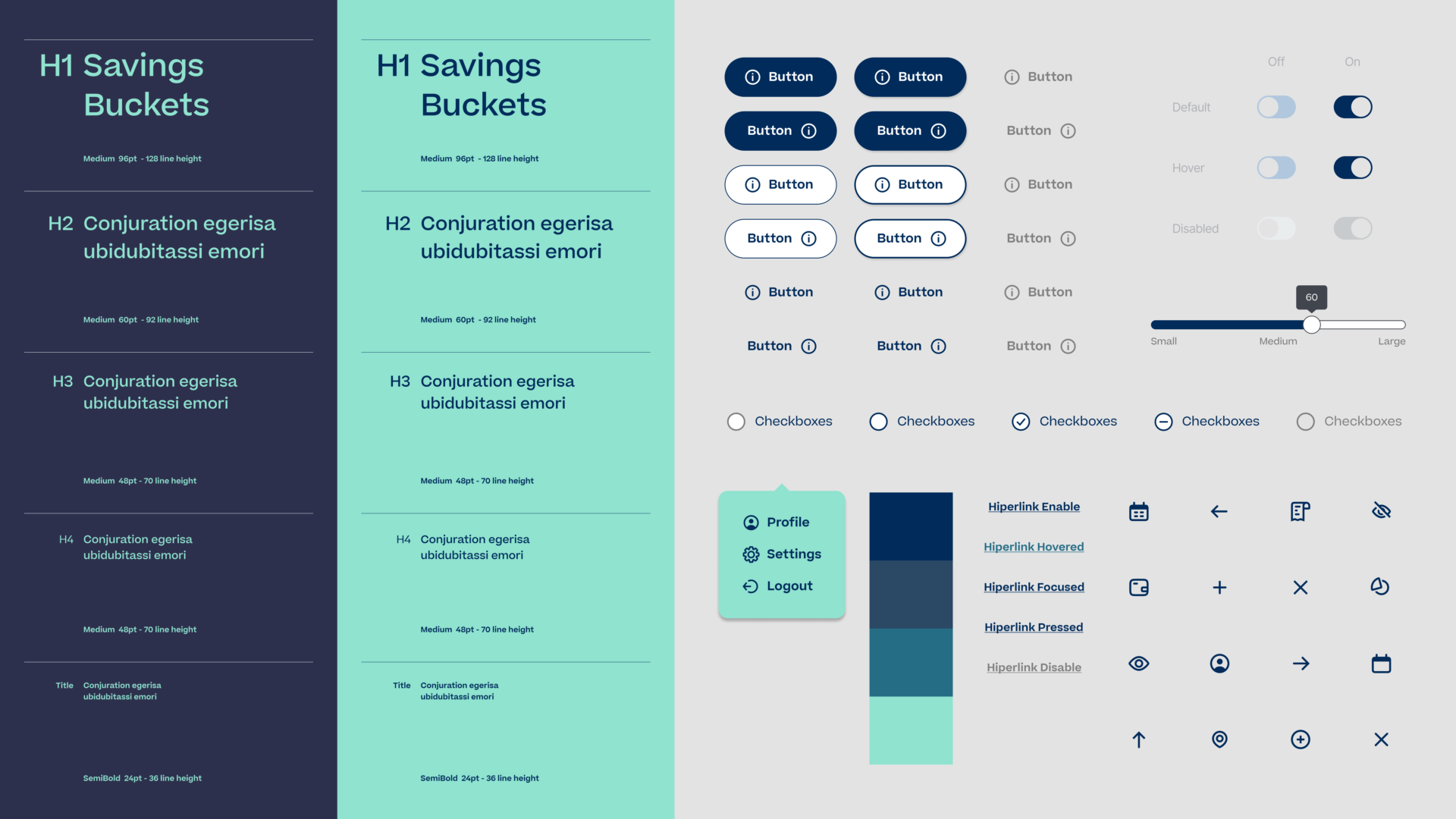
- Figma design system with tokens, components and usage guidelines.
- Interactive prototypes for qualitative validation.
- Content and microcopy guidelines (tone, clarity, accessibility).
- Lightweight PRD (problem, objectives, assumptions, risks, acceptance criteria).
- Prioritised backlog and incremental roadmap (no product metrics).
LEARNINGS
- Progress visualisation and micro-rewards foster adherence.
- Guided simplicity (wizard + defaults) reduces cognitive friction.
- Accessibility and clear microcopy build user confidence.
- Establishing a component system early speeds iterations and keeps coherence.
- Early qualitative testing surfaces language and navigation ambiguities.
NEXT STEPS (IF TAKEN TO MVP)
- Automatic deposits (round-ups, salary percentages).
- Shared goals (couples/groups).
- Open Finance integration for reconciliation.
- Variants for reminders and progress visualisation for future A/B exploration.
Note: Academic project; not launched. Emphasis on process and design artefacts — no product metrics.